New colours, new fonts and new photos
At TS TECH we have been discussing for some time a facelift of the existing visual identity and the creation of a new core narrative.
After many good talks across the organisation and between management and the ordinary employee - combined with our strategy GROW- we have concluded that you see rolled out on this website.
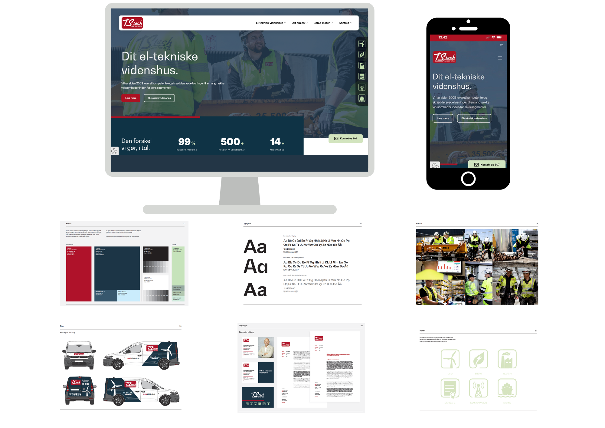
We have chosen fonts and colours that match the company we are and will be, namely Your electrical engineering partner. Black has been replaced with a less "harsh" but still definite colour in a dark blue. This signals to us the serious, serious, and proper. Our red logo colour has become darker, warmer, and again more "determined" in its expression.
We've also got a light green, which will most often be used for our segment icons - which have also been tightened - and to set a drop or. marking in graphic solutions, such as a "button" on the website and the like.
You can read our core narrative here - where we have cut to the bone and formulated ourselves in brevity - our "elevator speech". This is the speech our colleagues should be able to speak when, as the good ambassadors they are, they are asked, "Who is TS TECH really - and what does that knowledge house mean...".
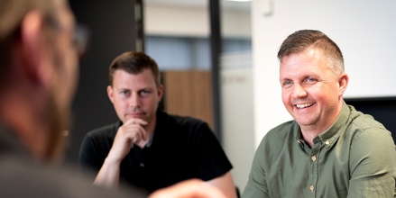
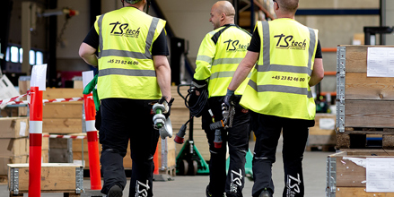
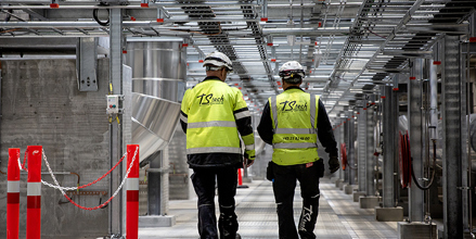
Photos, style, and tone. Lots of people. This has been our mantra in the new images and films that will henceforth present TS TECH. We are a house where our knowledge is one of the most important things we have - and our knowledge is equal to the people we are at TS TECH. Therefore, lots of people.
In addition, we have generally increased the effort around our internal and external communication. Put more effort into social media and sending updates and news internally. Efforts that are already bearing fruit when we must recruit and when we get around in the business world - and the private sector.
All in all, an exciting process that has just been rolled out on a new website, new design on the cars, new business cards, newly designed brochures and much more will come in the near future.

dd


 Contact


